Equal Earth Map Explained. What It Is and Why It Matters
When the average person looks at world maps, we may notice subtle differences but not particularly care. However, creating an accurate map of the globe requires a lot more than just drawing and positioning coastlines. In fact, there are actually different configurations of world maps for different purposes. And many of us do not understand the intricacies that go into trying to depict the grandness of the world in a single image.

The Mercator map depicts landmasses like Greenland, Russia and Antarctica, which are far from the equator, much larger than they are relative to other countries.
The version a lot of us are familiar with is known as the Mercator map. It has been around for almost 500 years and became the standard way back in 18th century. This Is the depiction of the Earth’s landscape many of us know from school.
No world map can be 100% accurate. All have shape and size distortions. The world is round, not flat. So flattening the globe to use on a poster causes distortions. And in recent years, the Mercator has been called out for such blaring issues. More specifically, on that image, lands further from the equator appear much larger than they actually are, in relation to other landmasses.
That is why for instance Greenland, which is northwest of Canada, appears just as large on the Mercator map as Africa. But in reality, the African continent is roughly 14 times bigger. And those types of realizations haven’t sat well with a lot of people.
So enter the Equal Earth projection. It’s based on a more recent standard that was created in the 1960s. In 2018, the developers of the Equal Earth projection upgraded that map, to make the size of different landmasses appear more accurate relative to each other. For instance, when you look at Greenland using Equal Earth, it now appears tiny compared to Africa.
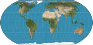
The Equal Earth projection of the world map
UNITED NATIONS ADOPTS THE EQUAL EARTH PROJECTION
When the Equal Earth projection was created in 2018, it wasn’t headline-generating news. But then, on 4 September 2026, the United Nations resolved to adopt it and shun the longstanding Mercator. And it appears that African countries in particular pushed for that change.
The Mercator map was designed specifically for maritime navigation purposes. Long story short, that’s why countries in the upper Northern Hemisphere, as well as Antarctica in the south, appear ridiculously huge.
On the surface, those discrepancies may seem insignificant. But the argument is that on a subconscious level, it makes places like Africa, that are given the shrunken treatment, seem less significant on the global stage than they actually are. And the opposite is true for countries that are rendered unrealistic big.
Along those line, some critics have even alleged that the Mercator is racist. But again, it appears those distortions were created more for navigational purposes.
EQUAL EARTH RESISTANCE
Reportedly, there hasn’t been much resistance to the U.N.’s adoption of the Equal Earth standard. All because they have endorsed this projection doesn’t mean that respective parties are required to use it. And it still remains to be seen if it will become the global standard. But a few nations still have beef with it.
Ukraine has issues, in light of its ongoing feud with Russia, due to how the hotly-contested Crimean peninsula is depicted. And so it is with Japan, who actually voted in favor of the Equal Earth projection. They feel that the color shading of the map implies that the Kuril Islands belong to Russia. But politically, there is an ongoing dispute between the Russians and Japanese over that territory. Likewise, India is favorable of Equal Earth adoption but is concerned about how an area it is feuding over with Pakistan is displayed.
What is interesting to note is that the United States was the sole country to outright vote against it. Their argument is that there are more important things the U.N. should be focused on. Furthermore, they see the Equal Earth Projection as “promoting reparations and “cognitive justice”. Or more simply put, they appear to be under the impression that these updated representations will contribute to demands of redress for European colonialism.
CONCLUSION
Considering that most of us will never use a world map for maritime navigation purposes, perhaps the Mercator has become outdated for general use. The Equal Earth map may have its issues also. For instance, it doesn’t depict “the true distance between different places” accurately. But after centuries of following to the Mercator standard, the U.N. has decided that Equal Earth is the way to go. And apparently, they are doing so primarily in an attempt to present a fairer depiction of the world map.